Talent Tech Solutions
Careers sites: where are Aussie businesses making the biggest mistakes?
This article originally appeared on the Talent Tech Solutions website and has been reproduced with their permission. The article can be viewed on their website also.
Every candidate has their own horror story about having to work with a truly awful careers site. Unintuitive design, clunky menus, candidates required to fill in dozens upon dozens of unnecessary fields - the list of what makes a careers site a bad candidate experience goes on and on. But what are the things that make a careers site good, and where are the places Aussie businesses are making the biggest mistakes? If only we had detailed, in-depth research with hundreds of weighted criteria to help answer this.
Enter Bas van de Haterd, a recruitment consultant from the Netherlands who has dedicated his life to measuring and ranking careers sites. His careers site rubric is world-leading and the closest thing to a definitive measure of a careers site’s quality and effectiveness we have.
In 2022, Talent Table’s Andrea Kirby licensed Bas’s rubric and applied it to the top 200 companies in Australia, ranking them by comparing the over 150 different metrics that determine the best careers sites in the world. Andrea’s research found the top seven career sites in Australia but also made a fairly shocking discovery.
It showed that the vast majority of careers sites came in one of two flavours: “pretty good,” or “terrible,” with only a handful of cases that were truly outstanding (and thus the winners). What’s more, a lot of the mistakes these “terrible” sites were making are ones that could have been easily rectified.
With the fight for talent growing increasingly fierce, can you really risk your recruitment “front door” (your careers site) serving up a poor candidate experience? Here are the top three things companies can work on to pull themselves out of that “terrible” category, as well as a few quick-wins that might just put them amongst those outstanding few at the top.
1. Time-to-apply is way too long
Please enter your date of birth. No, not like that, like this. Now select your availability via this complicated suite of drop-downs. Then input your address. Then input it again. Then upload all of your work experience that we already have from your resume. Then do a handstand while balancing a bowl of milk on each foot. Oh, and by the way, get ready for the selection criteria.
Every hoop you make your candidate jump through in their initial application is going to cause more and more drop-off. In a candidate-led market, especially amongst high-demand roles, lengthy time-to-apply is going to scare away your best candidates, and leave you with the ones who were desperate enough to slog through the process.
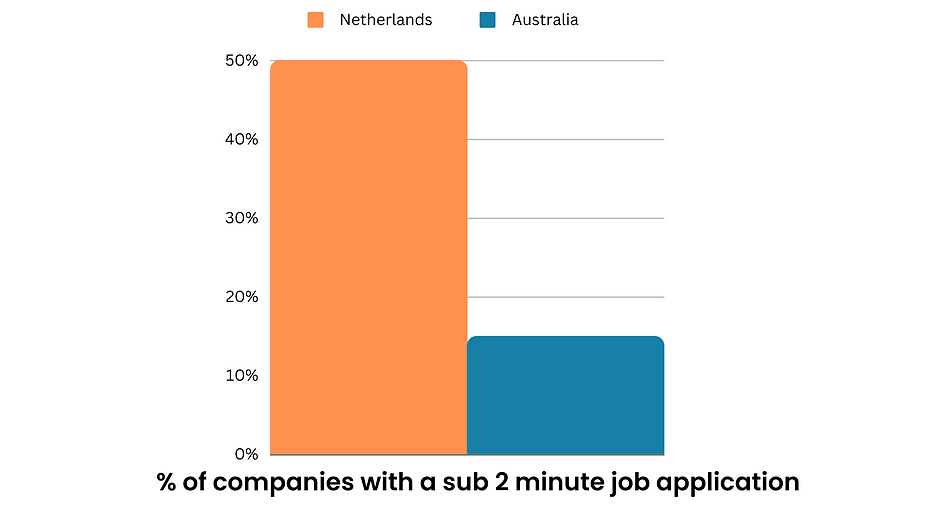
Over in the Netherlands, where Bas first started his research, he noted that 50% of Dutch companies had a time-to-apply of under 2 minutes. To contrast, in Australia that number is only 15%. So you could instantly propel yourself to the top 15% of Australian companies simply by reducing your time-to-apply below 2 minutes.
But how do you actually do this? Think about what information you really need from a candidate. The number one pet peeve from candidates is having to re-submit job experience information that is already contained within their resume. Is the value your recruiters gain from not having to dig through resumes to find information worth the potential loss of candidates? Or better yet, is there a tech solution that can automatically and effectively parse (i.e. read) and pre-fill this information?
Okay, but what if you really do need all of that information from a candidate. Well, do you need it upfront, and can you make the process of gathering it simpler? Is it possible to collect some information, such as working rights and availability, later on in the process? Of course this won’t work for every role and industry, but these are absolutely the questions you should be asking. Every process you can shave down or automate will cut seconds off your time-to-apply, which is a metric you should regularly be tracking as part of your Talent Analytics setup.
2. Text-only job ads
When was the last time you saw an advertisement on TV that was text-only? So why do most job ads still look like they still belong in a 1950s newspaper classified section? In Australia, a massive 72% of all job ads are only text, which considering the flexibility of the online format is a huge missed opportunity. We are often told to “show, not tell,” and it’s time we started doing so with our Job Ads.
So what can you do? For starters, as a super basic step one, add some pictures. Show off what the workspace will look like, what the work itself looks like, or any other angle of the company you want. Just having a few shots of your office will immediately put you in the top 28% of companies in Australia.
If you’ve got some time and budget, enhancing your content with icons and infographics to break up the text is your step two, and if you really want to propel yourself into the top 11% of sites that Bas’s rubric deems “beautifully designed,” then video content is an absolute must. “Day in the life of” videos are becoming increasingly popular as a way of showcasing to potential candidates exactly what the role entails.
Pro tip: You don’t have to be Spielberg (or have his budget) to make great video content. Authenticity is key, and low budget, “selfie-style” videos shot on a smartphone by an actual employee can be more impactful than a big fancy production. Tools like Video My Job (https://www.videomyjob.com/) have become increasingly popular for easily and economically accommodating this approach.
Having beautiful job ads not only increases your application rate, it also increases the quality of your candidates, as the more visual information about the role you provide, the less likely someone is going to drop out because the role wasn’t what they thought it was.
If you’re a larger company and not sure where to start, focus on those really hard-to-fill roles that have high drop-out rates. Those are the ones where you need to attract more, and attract quality.
3. Look-and-feel inconsistency
You’re online shopping at nike.com for some new shoes. When browsing the store, you experience Nike’s slick branding and look-and-feel. You find a pair you like and add them to your cart. All of a sudden that slick look-and-feel is replaced with a generic Shopify skin. The menus are different. You have to create a new account. You start to wonder if you’ve been scammed.
If you have a jarring transition to your ATS that sounds like something of the above then you’re in the bottom 25% of Australian companies. In extreme circumstances, this can make your candidates completely drop out of the process because they are worried they have landed on a scam website. Otherwise, it can invalidate all of the hard work you have put in to make your careers site pretty and user friendly. Think of it as shuffling a customer from your nice front-of-house shop into the dark dingy warehouse to complete their transaction.
We understand that often, companies have little-to-no control over the look-and-feel of their ATS. Many third party vendors are quite strict on what can and cannot be changed once candidates click on that “apply” button. If look-and-feel inconsistency is something that’s important to you, switching to a new Careers Site Management System or ATS/CRM vendor might be the best way to solve it.
Pro tip: Talent Tech Solutions has years of experiencing building Talent Tech Stacks that seamlessly integrate multiple pieces of tech across the entire recruitment process. We can help you find the right software for your company, to ensure that look-and-feel consistency.
Quick wins
While fixing the above issues is a sure-fire way to propel your career site into the top percentage of companies, they aren’t easy fixes, and will likely require some time and budget to address. Luckily, Bas’s rubric highlights a number of things that would be quick wins for many companies, and are honestly more of a “best practice” thing to keep in mind when reviewing your site.
Here are our top ones:
- Fix your “no jobs found” page. Someone searches for a job. They see “no jobs found”. They leave the site. Why not put some content on this page, such as similar jobs, or information about the company, to keep them engaged, and possibly look for another job?
- Make your accessibility adjustments policy clear. This is becoming an increasingly important issue among employers, as we realise that many potential employees will require some kind of adjustment to the recruitment process. Make it clear on every job ad, and throughout your site.
- Advertise your salary range. This one can be controversial, and I’m sure there will be many companies with policies against it, but it is undeniably a better and smoother experience for both candidate and company if you’re upfront about what you’re willing to pay for the role. If legislation in the US (read more) is any indicator of future developments down under, it might eventually be mandated anyway.
- Don’t neglect other social media. We all know we should be advertising on LinkedIn, but neglecting platforms like TikTok and Instagram, especially if your company has its own separate career brand, is potentially cutting off a huge portion of younger people.
- Use real employee photos. People can tell when something is a stock image, or an image of an actual employee. Using actual photos helps show your candidates you care, and it’s something that should be a very quick and easy fix.
The last word
A well-designed careers site is crucial for attracting top talent, but many Australian businesses are making significant mistakes. Simplifying the lengthy application process and reducing time-to-apply can enhance the candidate experience. Adding visuals like pictures, icons, and videos to job ads improves engagement. Consistency in look and feel, especially during the transition to an applicant tracking system (ATS), is essential for a seamless experience.
Quick wins such as improving the "no jobs found" page, clearly communicating accessibility policies, advertising salary ranges, utilising social media platforms beyond LinkedIn, and using real employee photos can make a big impact. By addressing these mistakes and implementing these recommendations, Australian companies can position themselves as leaders in candidate experience, gain a competitive edge, and attract top talent.
Need more help?
We can help - we're experts in designing and deploying careers sites. If your site has fallen into that “terrible” bucket or perhaps you've set your sights on winning a "Best Careers Site" award don’t hesitate to reach out for a consultation!
About the author
Steven Bogos is a content and marketing professional with over a decade of experience across the technology, education, retail, and telecommunications sectors. He has helped companies launch effective and accessible websites that focus on conversion - be it buying a product, submitting a lead, or applying for a job.


